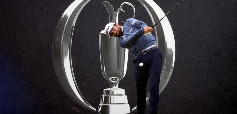
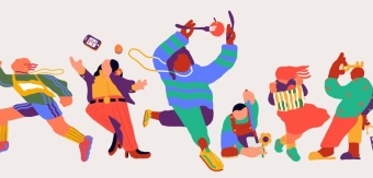
The R&A has launched its first significant rebrand for The Open, golf’s original major championship, in eight years with independent consultancy Zag. The rebrand coincided with the 151st Open at Royal Liverpool, which was played from 16th-23rd July 2023, with new assets used across the Championship.
Zag and their partner, teamup consulting, have worked with the R&A for a decade, helping shape brand strategy for The Open and creating activations to celebrate the 150th Open at St Andrews last year. Following this celebratory milestone, The R&A identified the 151st Open as a pivotal moment to look forward and bring fresh energy to a story steeped in heritage for players and fans of tomorrow.
To learn more, we spoke to Zag Design Director, Emily Flanagan.
What was the brief for the rebrand?
Following The 150th anniversary of the golfing Open last year, The R&A identified the Championship’s 151st year as a pivotal milestone in the life of the brand. The championship has an incredibly rich history and has developed a loyal and passionate audience over generations.
Looking to the future, The R&A were looking for a refreshed brand and identity that would bring new energy to a story steeped in heritage for players and fans of tomorrow.
How did the initial pitch/brainstorming phase go?
Zag and our partner, teamup consulting, have worked alongside The R&A for a decade, helping shape brand strategy for The Open and creating activations to celebrate the 150th Open at St Andrews last year. We were therefore very much in tune with The Open’s value as a brand and understood the direction they wanted to go in, and The R&A trusted us to find the best way to tell that story.
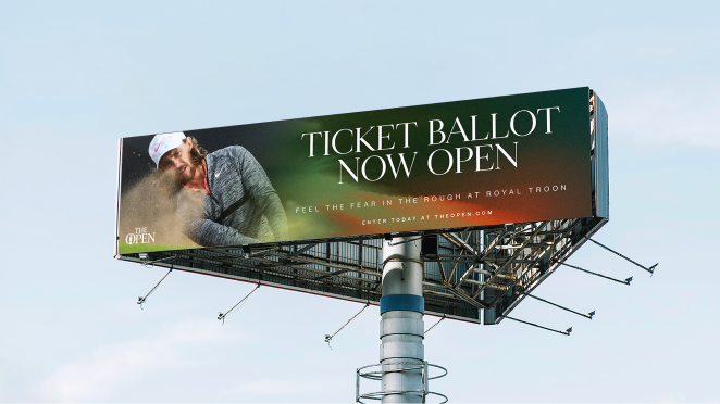
Kicking off the brand strategy, we collaborated with The R&A to gather perspectives from fans, players and key stakeholders through a series of interviews and workshops. These insights were critical in shaping the strategy, placing fans and players' connection with The Open at the heart of the rebrand.
Describe the purpose of the brand and its target audience
As the original international major golf championship, The Open has become synonymous with the sport and represents its purest form. Our aim for this rebrand was to ensure The Open connects not only with golf fans and generations who have grown up watching the championship, but also with sports fans who are inspired by immersive experiences - including younger and female audiences who currently make up a lower proportion of The Open’s current fanbase.
What was your thinking behind the rebranding solution?
As the golfing landscape continues to experience change, we wanted to focus on the timelessness of The Open. There's no greater challenge than the one set by nature on some of golf's toughest, most historical courses. The unpredictable conditions of a links course and the internal battle to hold form and to be crowned the true champion.
That’s something every golf fan understands and something we want new fans to appreciate. So, we crafted new brand assets that amplify the different emotions and encounters throughout the Championship, empowering The Open with a more digitally fluent and agile mode of expression.
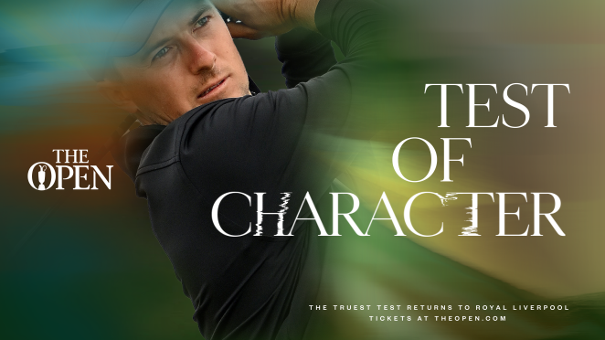
The new set of logos embraces all of the elements of sun, wind, water, and earth, capturing the immersive, powerful, and unpredictable natural forces that present the ultimate challenge to all those who play links golf.
We activated the logo by imbuing it with the colours and textures of each element through animation and visual effects to convey the emotional and physical effect the elements have on a links golf player: the impact on the earth as a player strikes the ball; the untamed, wild winds of links golf; the warmth of the dawn at the start of play; and the coastal spray and unpredictable showers that test players and are unique to The Open.
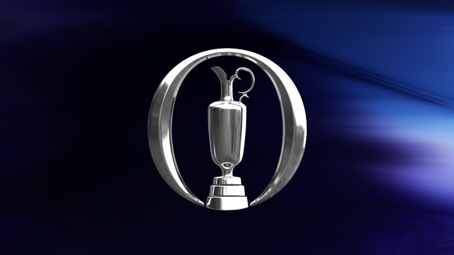
Finally, the metallic shine of the iconic Claret Jug, which is presented to the Champion Golfer, evokes the sense of triumph associated with overcoming all of these elements. We were ecstatic to deliver a set of five curated toolkits of poetic, visual branding that can be used across all touchpoints at varying relevant moments.
Did you learn anything new during the project?
The landscape of golf is changing rapidly, from fashion collaborations with rappers to the new LIV Championship. It was integral that our strategy and creative felt authentic to The Open experience and gave players and avid fans a brand that they could embrace without losing the integrity the original strategy.
We worked closely with R&A to understand the complexities they faced in delivering the event so that we could equip them with brand toolkits that would ease their challenges, give them more confidence and create greater impact.
What was the biggest challenge? How did you overcome it?
The biggest challenge was visualising the nuances of the elements earth, water, wind and sun. Growing our understanding of why these elements are unique to links golf and then telling that story through the suite of assets; from the iconic logo and typography through to the gradient textures for grandstands and motion graphics.
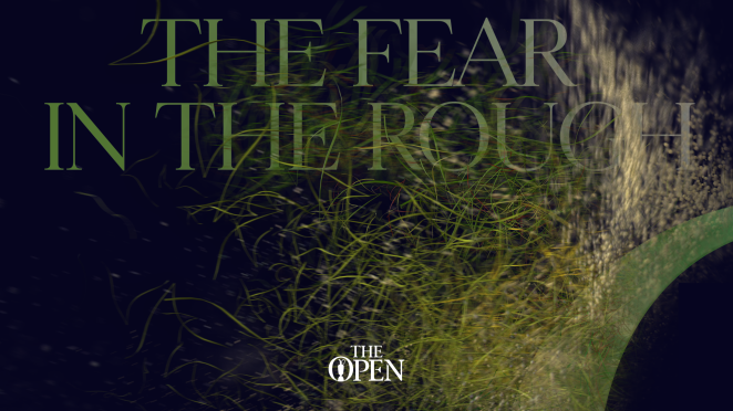
How can the water gradient reflect just how wet and wild Scottish links courses can be? How do we portray wind within the iconic symbol - something which cannot be seen? How do we unlock how the rough on earth resembles links grass? Depicting the power of these elements, and positioning them as untamed and unpredictable, allowed us to create a more iconic and authentic brand for The Open.
What kit/tools/software were used to create it?
We worked closely with Bose Collins to define the aesthetic of each symbol, imbuing textures and colours into 35 logo idents in both motion and static, elevating the symbol to an iconic status.
From the animated logo, custom typography, textural gradients and an emotive tone of voice, to mapping the event experience, we wanted to create a dynamic world that places the external and internal challenges at the centre of the experience.
What details are you most proud of and why?
I was lucky enough to attend this year’s event and seeing the incredible resolution of the 5m symbols that we created with BoseCollins was a rewarding moment, after many months of back and forth, ensuring that the logos maintained the integrity of the original symbol and accurately represented links golf.
Equally, the immense detail within each of the 10 gradients that were made to feel reminiscent of the weather-like paintings, printed on the grandstands at great lengths, felt truly exciting.
What visual influences fuelled your solution?
Many hours were spent looking at grass types across different golf courses, looking at how the wind blew across grass to understand it’s power, weather systems and colours within these textures; references to get an idea for how we could graphically show the heat from the sun’s glare in motion and it’s colour palette, to illustrate this across the toolkit.
What do you hope it achieves for the brand?
The rebrand has been designed to further The R&A in its ongoing journey to tell the story of The Open more effectively, enabling the Championship to connect with fans more meaningfully and to capture the imagination of both old and new audiences.
Our long term approach towards this pivot for The Open has enabled the brand to celebrate its incredible heritage but also allowed it to maintain its relevance in today's world, enhancing the passion and drama for the championship.
It has also given the internal brand team a new design playground from which they can create striking communications that will talk with clarity and purpose about The Open’s unique place in the global sporting calendar.
What would you do differently if you could do it over again?
Instead of doing something differently, I’d love to keep working closely with The R&A to grow the brand and current suite of assets. This strategy has a big story to tell and there’s many new places we can push it. Continuing this journey alongside them, will help strengthen content creation, implementation and create exciting new experiences at the championship.
Please could you provide a credit list for the work?
Emily Flanagan – Design Director
Neil Gilchrist – Senior Designer
Neil Cummings – Executive Creative Director
Sophie Aluwihare – Project Director
Fred Popp – TeamUp Consultancy Partner
Luke Vincent – Strategist
Benj Aluwihare – Copywriting
Bose Collins – Animation and Render Partners
Kelly Laskiewicz – R&A Head of Brand
Marie Morrison – Brand Manager
Miller Cornelius – Brand Coordinator
